
Visualize your time-use data
Quickly design and customize your own time-use visualizations. This website provides a collection of time-use visualizations and their code to help researchers and other interested people to create their own time-use graphs.

We migrated to serverless but
You will be able to do it yourself.
We will walk you through the steps to creating your own visualizations using R. The R package and their tutorials are on GitHub. Step-by-step tutorial is linked here.
Create graphs faster
Everything you need to create graphs for your blog
We primarily focus on creating visualizations of time-use data for web-oriented outlets. You will be able to create them for your online blogs and wider-audience-oriented journalistic articles.
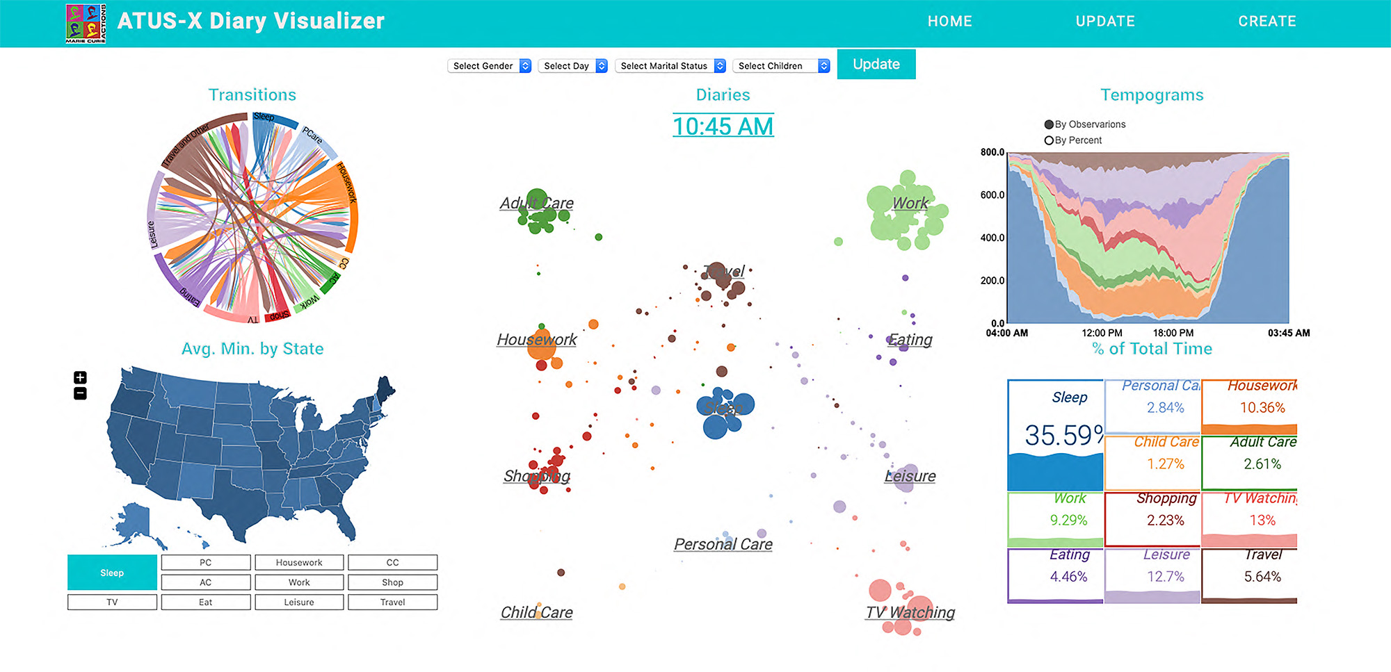
Tempograms
Tempograms allow visualizing multiple 24-hour diaries as area plots.
Transitions
Transitions help figure out which activities are more likely to follow.
Moving Paths
Path diaries visualize diaries as paths from activity to activity.
Maps
Maps help visualize averages by US states.
Total Time
Total time visualizations help summarize where all time goes.
Easy Code
Packages will help you create your graphs easily.

Time-use research is a fascinating field of interdisciplinary study, aiming to explain and predict people's everyday behavior. These packages will help you reach wider audiences with compelling graphs.
Learn
Helpful Resources
Here are all the tutorials you will need to run these graphs on your own blog or provide embeddable links to your graphs.


Connect with us
We’re here to help
If you have any questions or cannot figure out how to make things work with all the tutorials above, please do not hesitate to contact us.